Case study:
Orchard Church
Goal:
A minimal, unique logo featuring fruit imagery for a new LA-based church plant
A pastor approached me about working on a logo for his LA church plant in hopes of creating something clean, fresh and minimal. From the start it was clear we needed something different from the standard church imagery of crosses or bibles. The focus needed to be on the welcoming community of the church plant as well as the idea of personal spiritual growth (fruit). We went through many iterations before landing on the idea of a table.
Process

Fruit varieties
We explored many iterations of fruit groupings (favorites were fig, peach, pear) to play on the idea of different types on people coming together as one body, each bearing “fruit.”

Branch
The idea of an olive branch has biblical ties and was intriguing, though possibly too detailed. Though olives are a fruit, we wanted something with a bit more substance that produces more “meat” or juice.

Table
Once we landed on the idea of a table as a place where people gather together, we worked through the best way to communicate that visually. Trying to decide on how to portray the table was a challenge, but ultimately we went with a subtle gesture of a tabletop.
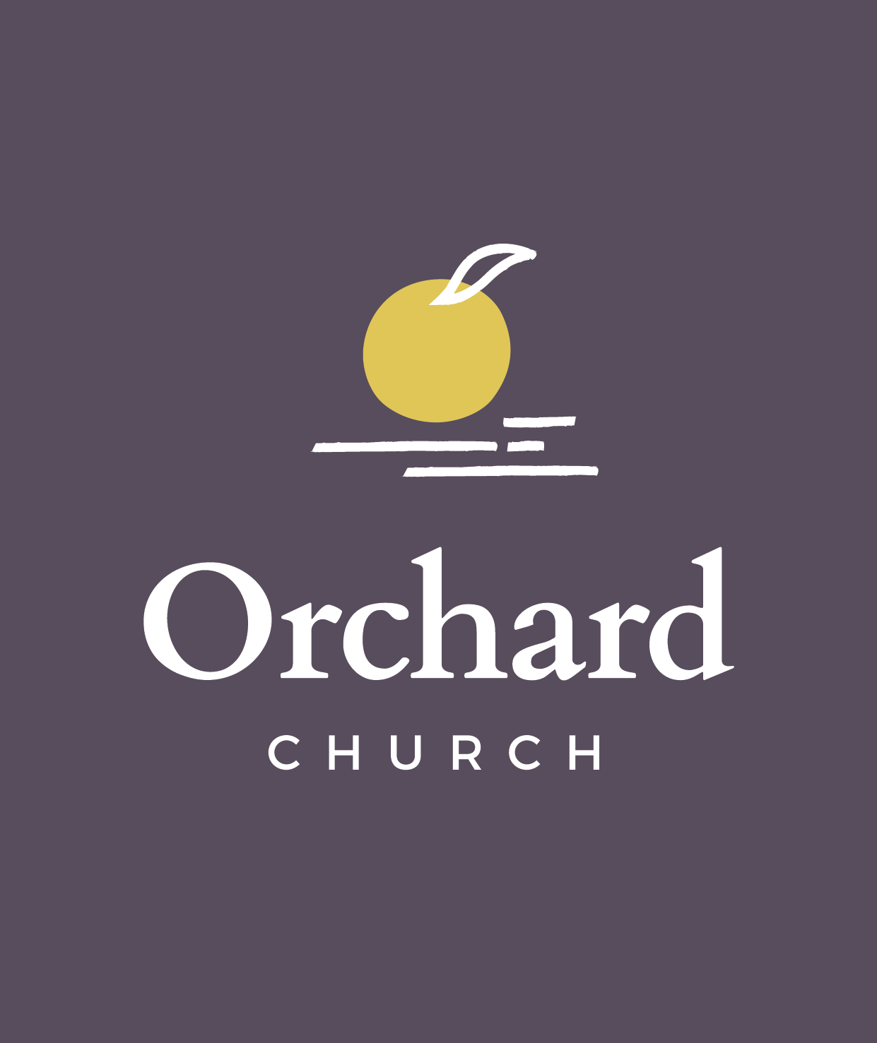
The final product
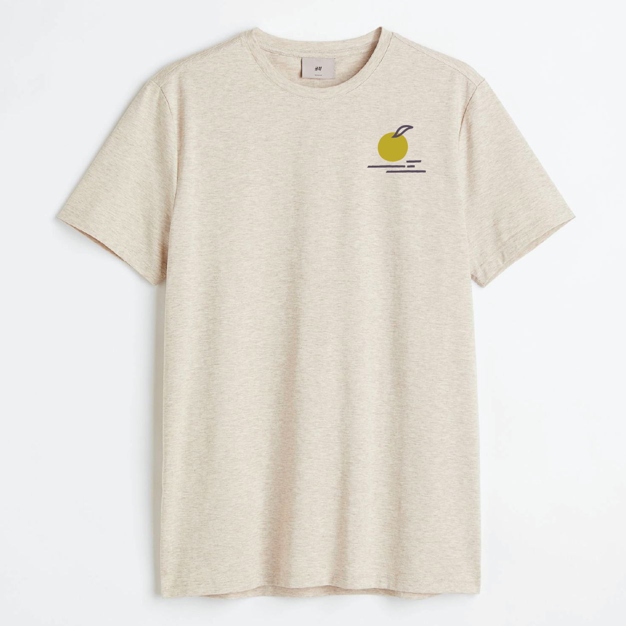
We ultimately landed on the idea of fruit sitting on a tabletop. The fruit is left unspecified, it could easily be a peach or an orange or something else with a similar shape. The lines and shape of the fruit and the gesture marks underneath all have a bit of texture and are imperfect, adding to the idea of imperfect people joining together in community. We chose Cardo for the serif “Orchard” and the simpler, clean sans serif Monserrat for “Church.” Cardo was specifically designed for linguists and biblical scholars which felt appropriate for the audience.